For discussion of this blog post, or if you’ve noticed I’m obvious wrong somewhere, discuss here!
The long-term future of the Starlink constellation is a topic that I’ve seen a dearth of serious modelling and discussion of. Most of the discussion is either predictions of world conquest founded in economics but without modelling to quantify the points, or great underestimation of the potential of what the space industry will become.
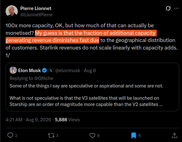

This blog post covers ideas that have been percolating in my mind for over a year. A couple of weeks ago, I was finally spurred on to modelling and writing it up after I saw a post by Pierre Lionnet, one of the few members of the rapidly growing field of space economics. In essence, his conjecture is that the marginal value of each additional Starlink satellite decreases fast enough to limit how large of a constellation SpaceX can economically build.
Additionally, I’ve debated my now former and currently future boss, Casey Handmer, on Starlink a couple of times, and it’s time to think through the problems to completion, point out what he got wrong, and which points require more nuance.
Casey previously wrote Starlink Is A Very Big Deal in 2019, which is an exceptional analysis and great primer on the potential of Starlink. In an effort to expand the knowledge of the world rather than merely repeat the same ideas, my analysis relies more on modelling whereas Casey expounded the fundamentally important ideas behind why Starlink has such great potential to serve a large portion of the world’s internet traffic, why it’s a requirement for increasing launch rate, and how it will be (and now currently is!) paying for Mars.
In this blog post I’ll start by giving you a mental model of the problem space by describing all of the technical aspects of the Starlink constellation that are relevant to this analysis and the economic principles that are required to understand this analysis.
Once we understand the problem space, the application begins where I’ll show that the marginal revenue of each additional Starlink satellite is high enough for SpaceX to serve the entire world’s internet usage, quantify cost and satellite count requirements, and determine Starlink’s TAM.
I’ve found in doing many technoeconomic analyses that being directionally correct is often (always) more important than being correct in magnitude, and it’s futile to attempt to be correct in magnitude anyway. For example, if you’re predicting the rise of EV Robotaxis, it is far more important to know the shape the growth curve will follow and the end state than make precise predictions of on X year market share will be Y. As such, this analysis will focus on being directionally correct, with some liberties taken on magnitude (eg. maybe TAM is 50% higher than I predict, oh well).
As usual, all charts and code is available on my Github. Claude didn’t know exactly what I wanted at many stages, so apologies for the mess.
Global Starlink Satellite Distribution
Before we model how Starlink can serve customers, we must understand the orbits of the Starlink satellites and how they overlay onto the population distribution of the Earth. This ground had been well trodden by Casey, and now I can improve the explanation through better data and prettier charts thanks to Claude.
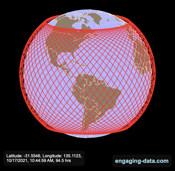
Above you see the orbital track of the International Space Station. Over the span of an orbit, it covers from 51.6 degrees north to 51.6 degrees south. As the Earth rotates underneath it, its longitude changes and over a long enough period of time it overflies every point on the Earth’s surface within +/- 51.6 degrees latitude.
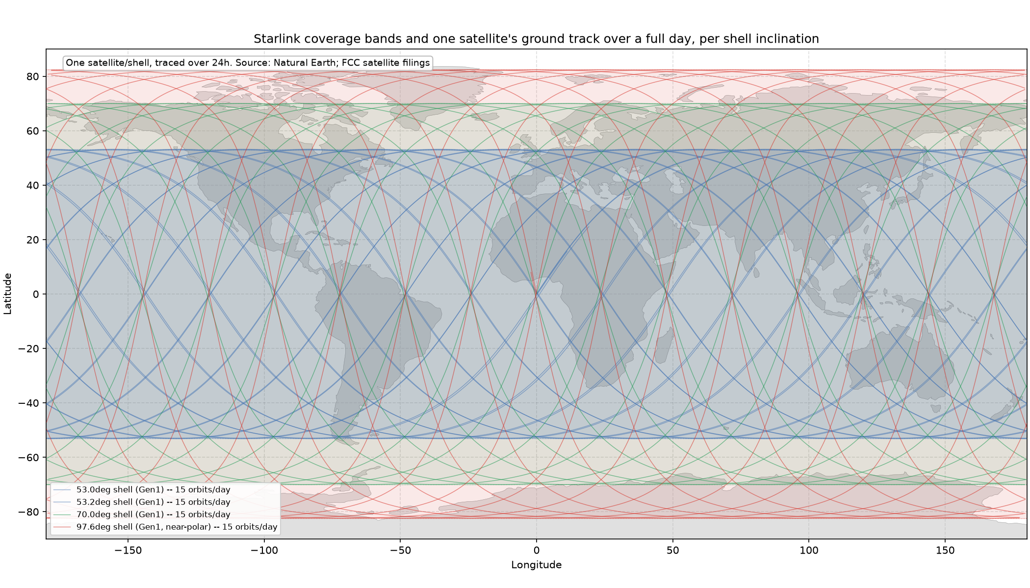
Next, we can overlay all the Starlink orbital shells from SpaceX’s gen1 constellation filing with the FCC. We notice 3 primary shells at 53 degrees, 70 degrees, and 97.6 degrees. SpaceX launches the majority of Starlink satellites to the ~53 degree shell because the majority of people live within 53 degrees of the equator. Higher latitude shells have far fewer satellites to serve the far sparser northern populations (Australia and South America aren’t too far south, and are covered by the 53 degree shell).
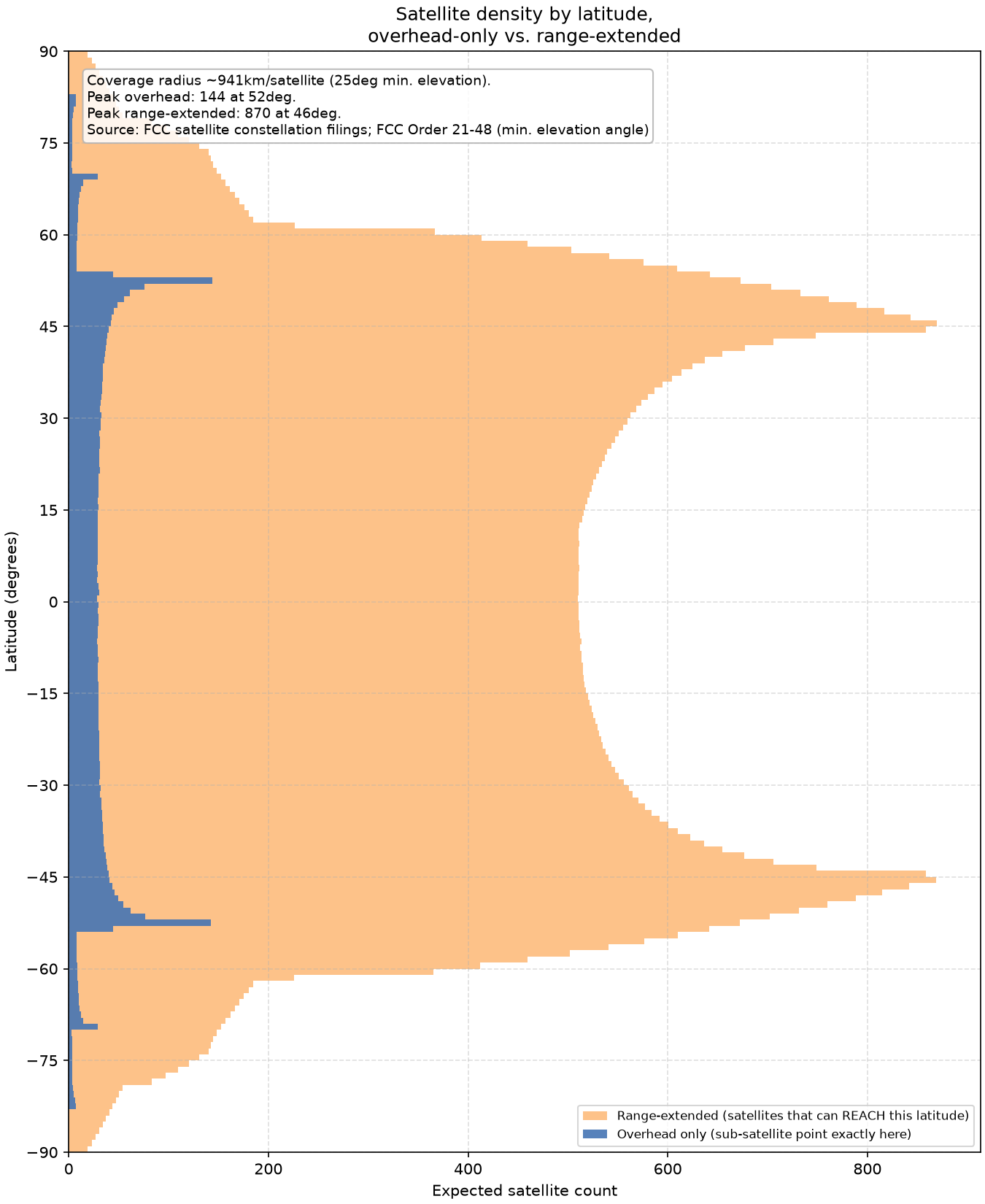
To gain a more intuitive understanding for how much time satellites overfly particular latitudes, consider the chart above that simulates SpaceX’s gen1 constellation. It shows how many satellites occupy a particular degree of latitude at a given time (blue) and the portions of the Earth that they can see (orange).
Notice that each orbital shell has a spike at its minimum and maximum latitude. Satellites pool at the extremes of their inclination because at the peak/min latitude their velocity is mostly horizontal relative to the Earth rather than vertical. This point is made clearer if you take another look at the diagram of the ISS’ orbit above and notice the increased density in orbital path lines at its peak latitude.
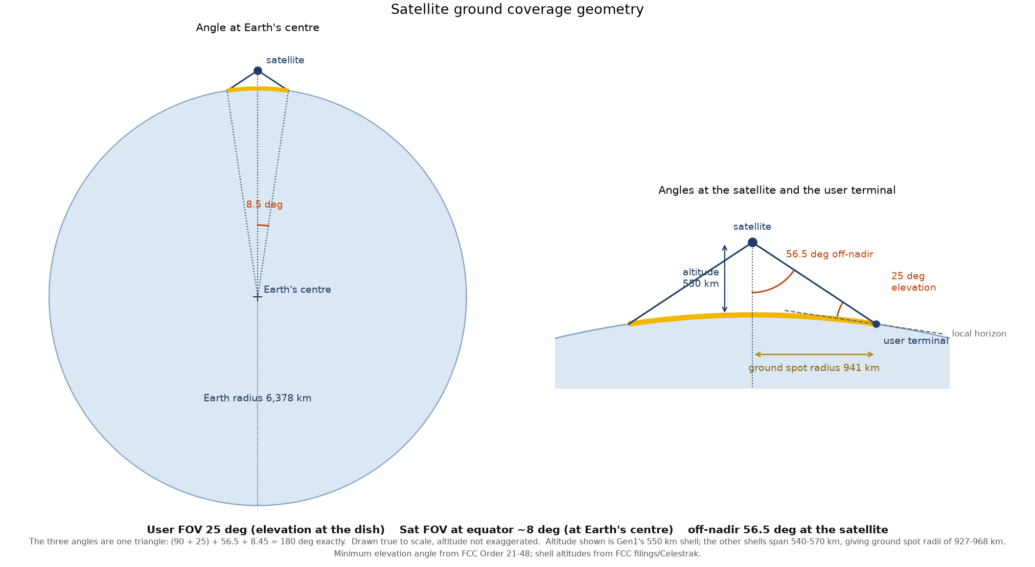
Satellites can see more ground below them than their exact latitude, as illustrated by the orange section in the previous chart. The Starlink user terminal is limited to a 25 degree elevation angle (Source, page 2 footnote 3), which means each satellite has a servable ground spot radius of ~941 km. I use this 25 degree figure as a best case scenario, if in the end user terminals can’t reach such low elevation angles, the constellation size for serving a constant number of users may increase 10-25%.
Global Population Distribution
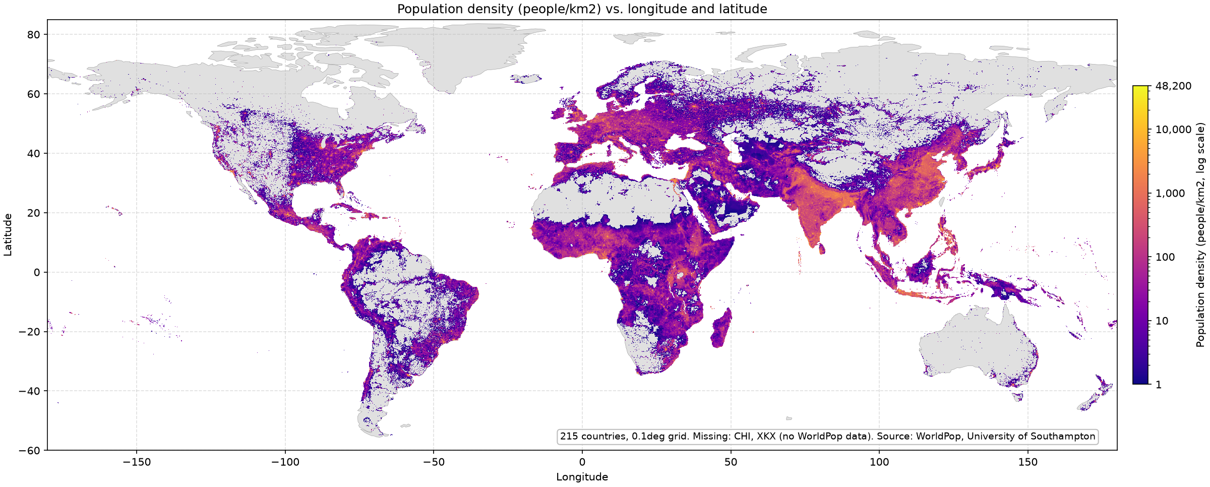
With our satellite density vs latitude model we gained an intuition for how Starlink capacity is distributed around the globe. Now, we can overlay this model of satellite distribution onto the global population distribution. Above you see a population density map of the entire world, which looks like what you would expect. The highest density regions are India, China, some parts of Africa, Europe, and the Eastern US.
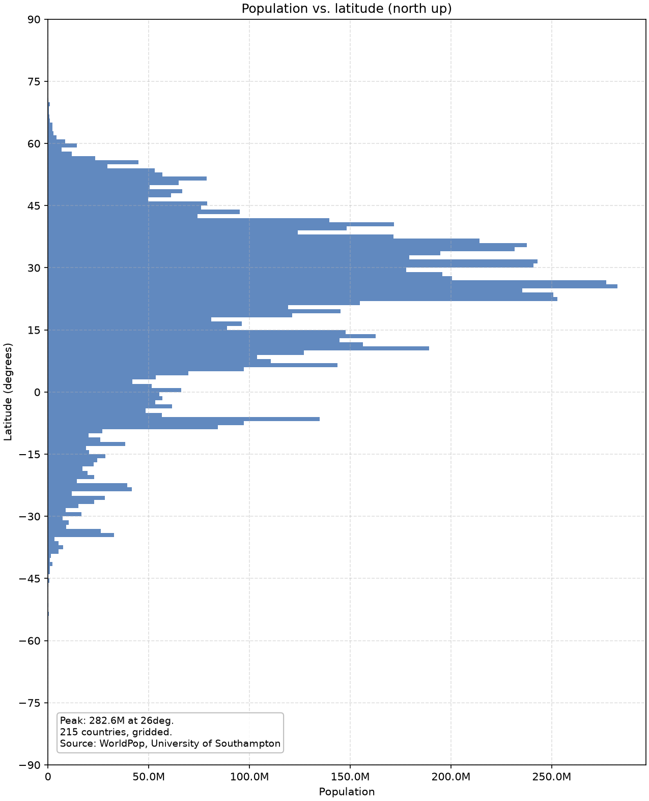
Next, we can take that distribution and turn it into a people vs latitude chart like we did for the Starlink satellites. Already, we see a peak around 30 degrees, which differs from what we saw from the Starlink constellation.
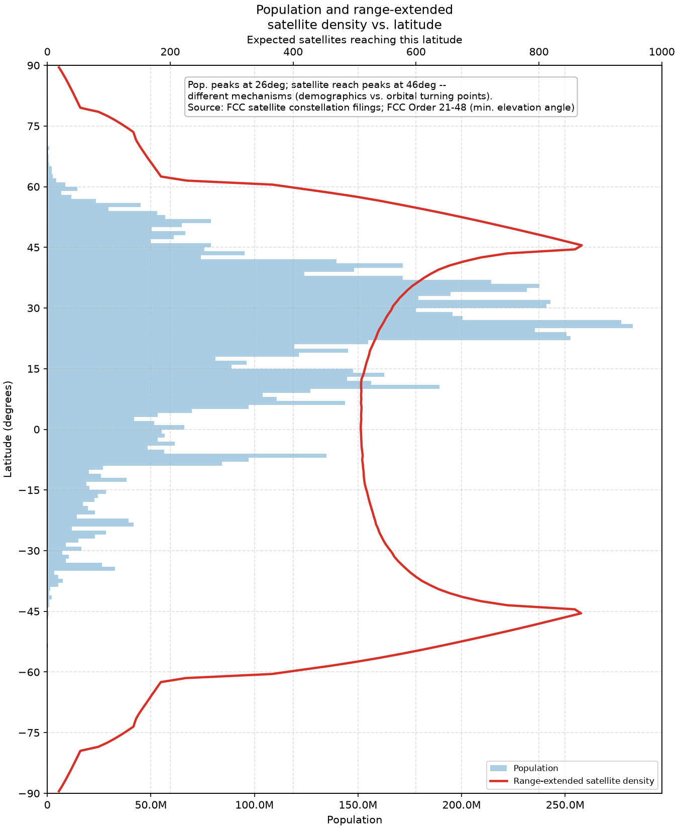
Overlaying the population latitude distribution onto the satellite capacity distribution, we see a significant lack of capacity utilization in the Southern Hemisphere.
SpaceX optimized the gen1 Starlink constellation for the US market, which sits at 30-50 degrees latitude. However, because satellites orbit the entire Earth, this means they have equal capacity at 45 degrees above the equator and 45 degrees below the equator. This evokes the point I made in my Reflect Orbital blog post, where utilization is extremely low for satellite constellations because they spend so much time overflying water (or land) without any customers on it.
Furthermore, notice that the peak at ~45 degrees does not line up with the population peak at ~30 degrees. This is again because Starlink is optimized for the US, whereas a constellation eg. optimized for serving the population of China would pick a lower inclination orbit of ~25-30 degrees.
This uneven population distribution allows Starlink to effectively subsidize certain parts of the world, while higher income nations provide the majority of the revenue for a single satellite. If a satellite is profitable from just overflying the US for ~5% of its orbit, then connectivity can be provided to any other country for effectively zero cost (minus the cost of the user terminal). More on this in the final satellite utilization section.
Servable Population Density by Constellation Size
Next, we need to dive into what is often cited as the reason Starlink can’t compete with terrestrial ISPs, Starlink’s servable population density limitations.
Because Starlink capacity is evenly distributed around the world, it is well suited for serving low population density areas where a constant amount of capacity overhead is divided over a small number of users. This is in contrast to traditional fiber lines which prefer centralized high-density users so that the length of fiber can be limited.
This analysis is downstream of any hardcore technical analysis. I don’t know nearly enough about RF communications to begin to understand these exceptional videos some of you have undoubtedly already seen on the technical details behind Starlink. So, I assume any technical limiting factors like beam density in high population-density areas are solved (eg. SpaceX buys more spectrum, or, while I’ve been writing this, SpaceX buys yet more spectrum). Casey Handmer came to a similar conclusion in his blog post.
Last time I wrote that I don’t fully understand a technical topic in a blog post it was about electrolyzers, and after 4 months of working on them I have far more knowledge than I did at the time of the post, maybe the same phenomenon happens again and I accidentally start working on Starlink next year.
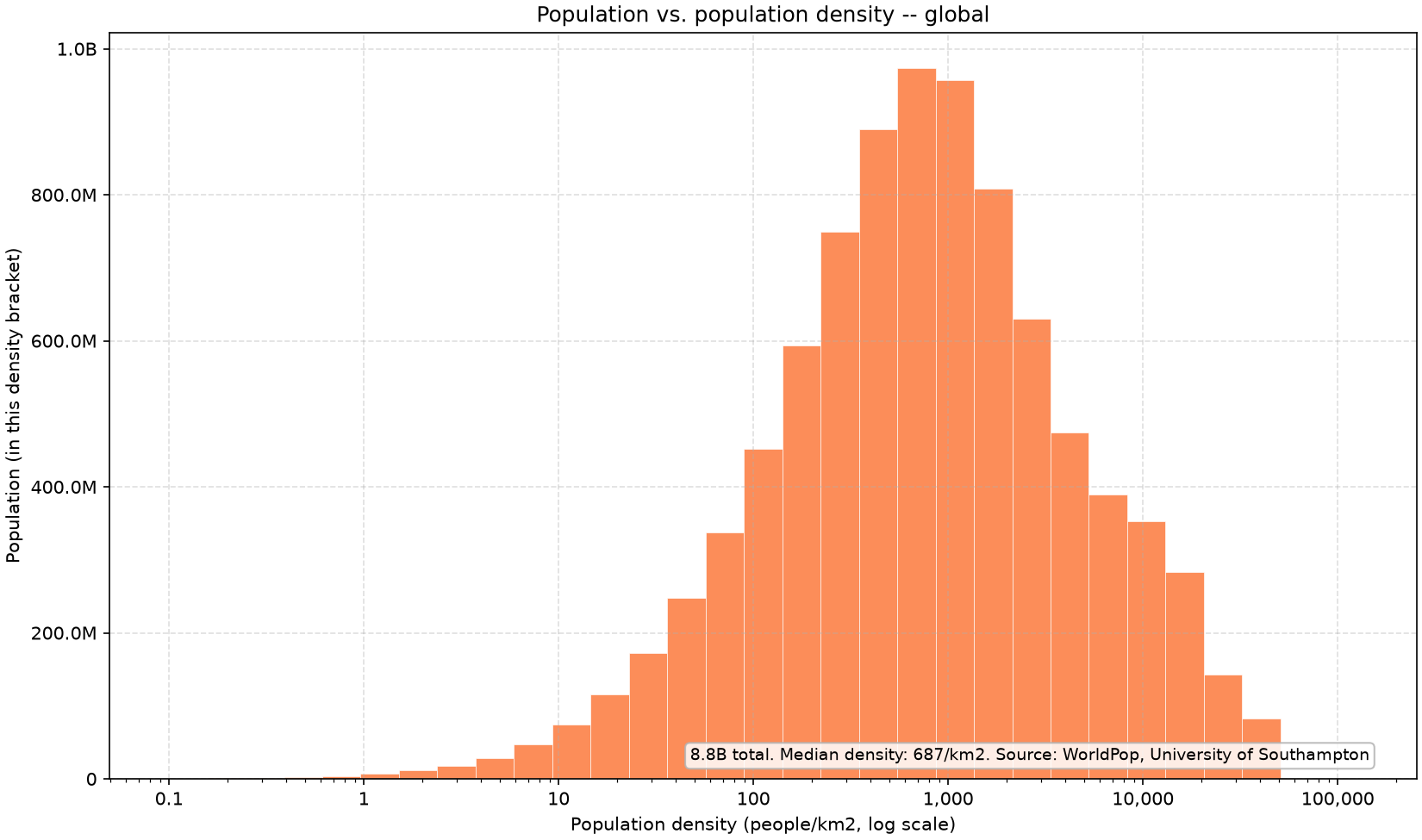
First, we take our global population distribution map from a previous section and get the population density distribution of the world. Notice that the mode value is ~1000 people/km2, which is equivalent to a suburban neighbourhood. Extremely urban city centers at 10,000 people/km2 comprise relatively fewer people.
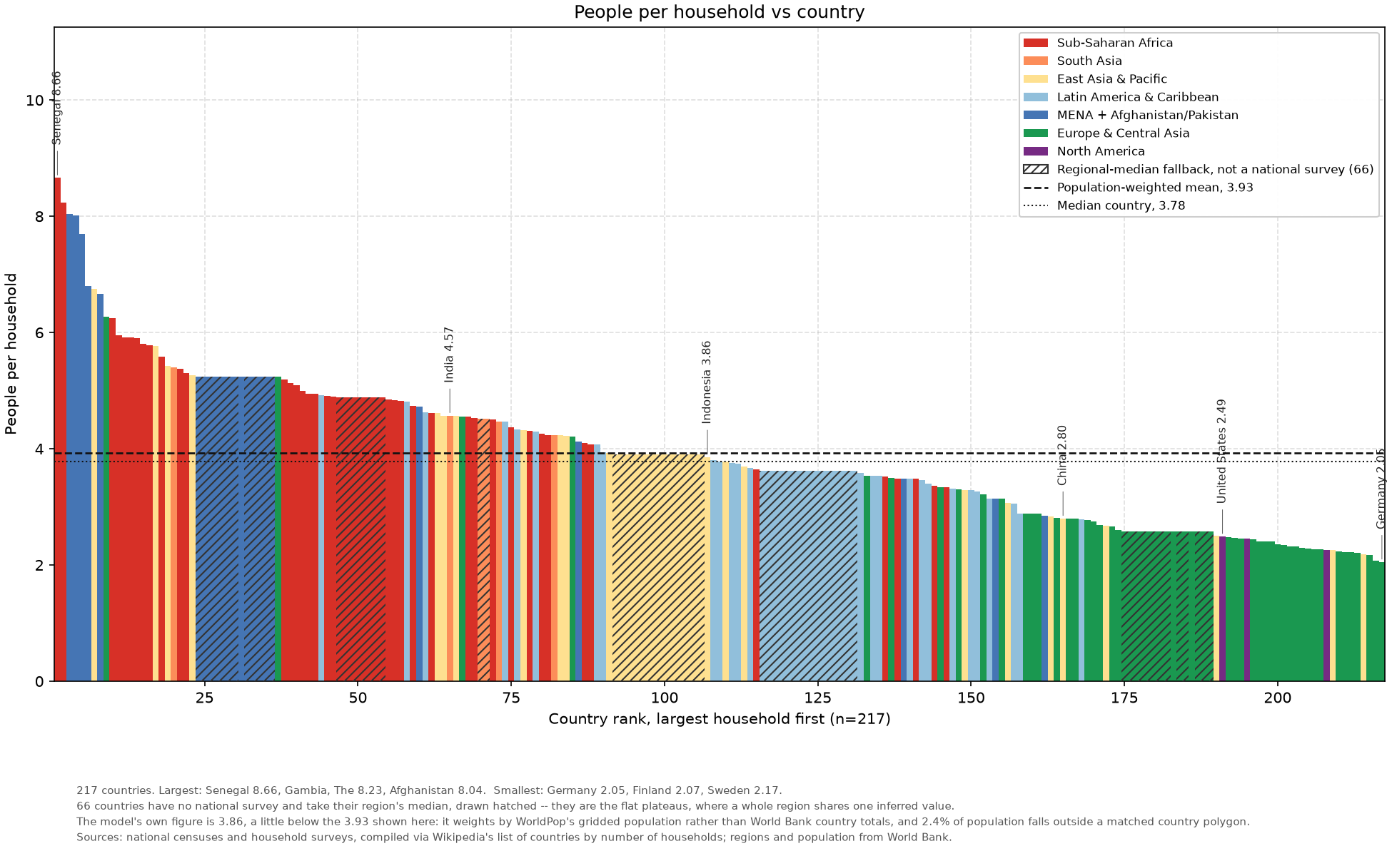
Next, we’ll need to convert our population density numbers into user density, as multiple people can share a single Starlink user terminal. To do so, I got a dataset of people per household for various countries around the world, which is shown above. Note that I’m only modelling households as users, whereas in reality Starlink also serves businesses, ships, aircraft, etc. This means the model slightly underpredicts TAM which we’ll see later.
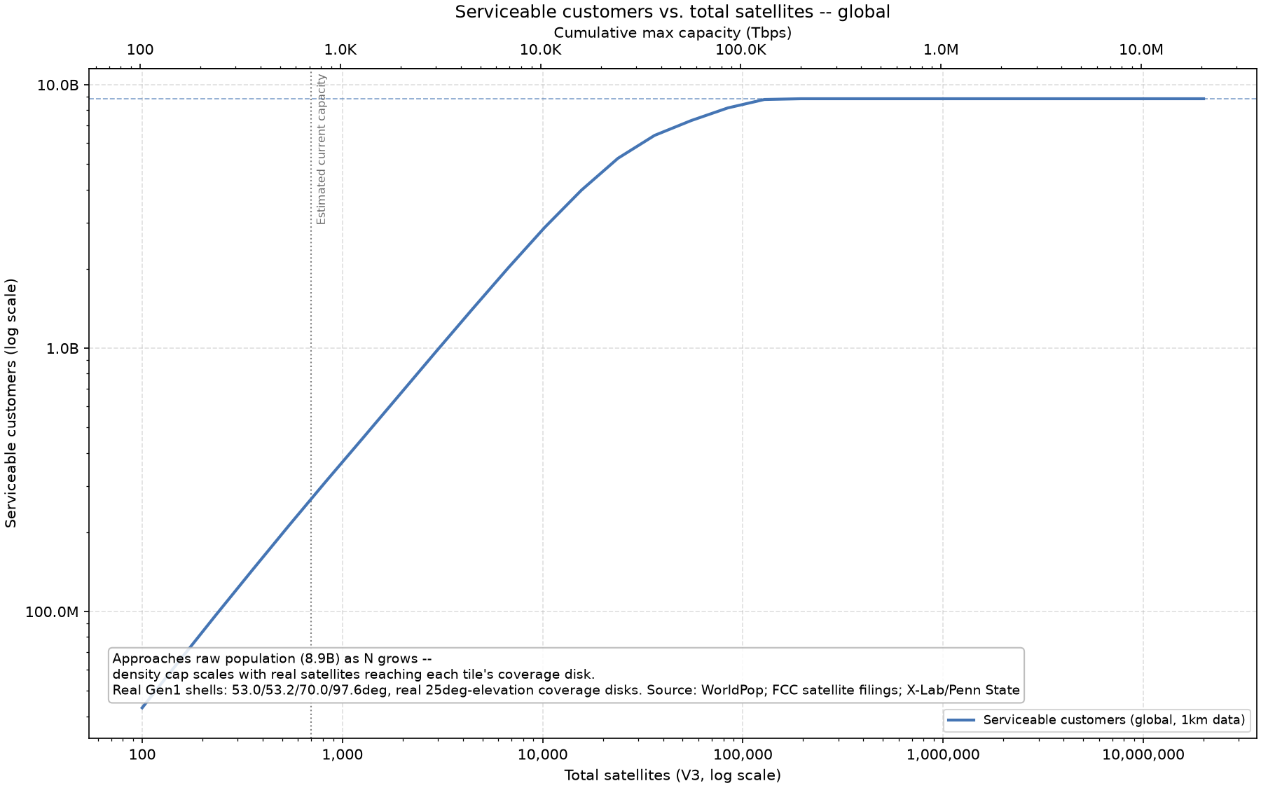
Finally, we have a model of global satellite distribution, global population distribution, and user density, which allows us to model how many people we can serve versus number of satellites in orbit. The graph above shows the output of such a model, where the capacity required to serve all households in the world is ~100,000 Starlink V3 satellites.
Note that in my model I require that each user has 100 Mbps of download capacity and 20 Mbps of upload capacity, the FCC’s current definition of broadband internet.
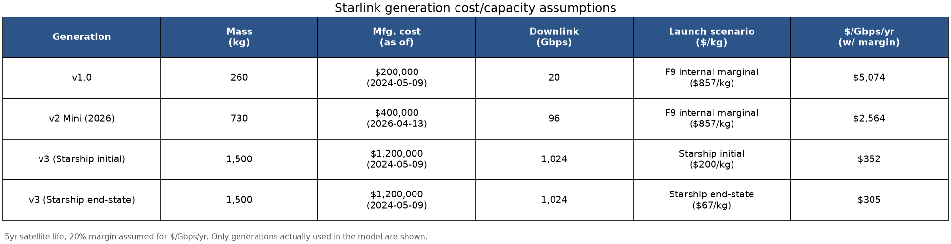
To understand if ~100,000 Starlink satellites serving all households in the world is a reasonable number, we can step back and look at the capacity of each Starlink satellite.
A single Starlink V3 satellite can provide 1 Tbps of downlink capacity. This satellite to ground download capacity is not equivalent to internet backhaul capacity, which is primarily served by those undersea cables you’ve heard about.
Starlink primarily operates in a “bent-pipe” configuration where a user has a data packet, that packet goes up to a satellite, and almost always immediately comes back down to Earth to a Starlink ground station. The alternative to a bent-pipe architecture, is using laser interlinks between satellites so that a packet comes up from a user, bounces between Starlink satellites to another section of the world, and then goes down directly to the recipient of that packet.
SpaceX’s laser link backhaul capacity is 2-4 Tbps per Starlink V3 satellite. As Jade_42 points out in a response to me, if a packet travels across 10 lasers the backhaul capacity is now 0.2-0.4 Tbps. So, carrying a packet around the globe is an expensive endeavour for a satellite internet constellation, and this is part of what determined the architecture behind Blue Origin’s TeraWave constellation, which is optimized for data backhaul.
I believe the solution to the backhaul problem is placing commonly served packets at the edge (eg. on the satellite itself, or just at ground stations). If everyone watches the same Netflix show, then you don’t need to send those bits across the continent every time. Instead, you cache that data closer to the user. This is why SpaceX partnered with Cloudflare.
For this reason, we can discount the effects of backhaul on our model and consider just download capacity of each satellite. If user upload capacity ends up being a limiting factor (what goes up must come down), then SpaceX can allocate more spectrum to uplink. Currently the majority is dedicated to downlinking data.
Global internet traffic is on the order of 10 Pbps = 10,000 Tbps. My model predicts that for global saturation we require 100,000 Starlink V3 satellites = 100,000 Tbps. This results in a launched capacity 10x higher than is utilized. Given that satellites won’t spend all of their time over customers, a 10x utilization factor is a reasonable assumption. More on satellite utilization and the economics associated with it in the final section of this blog post.
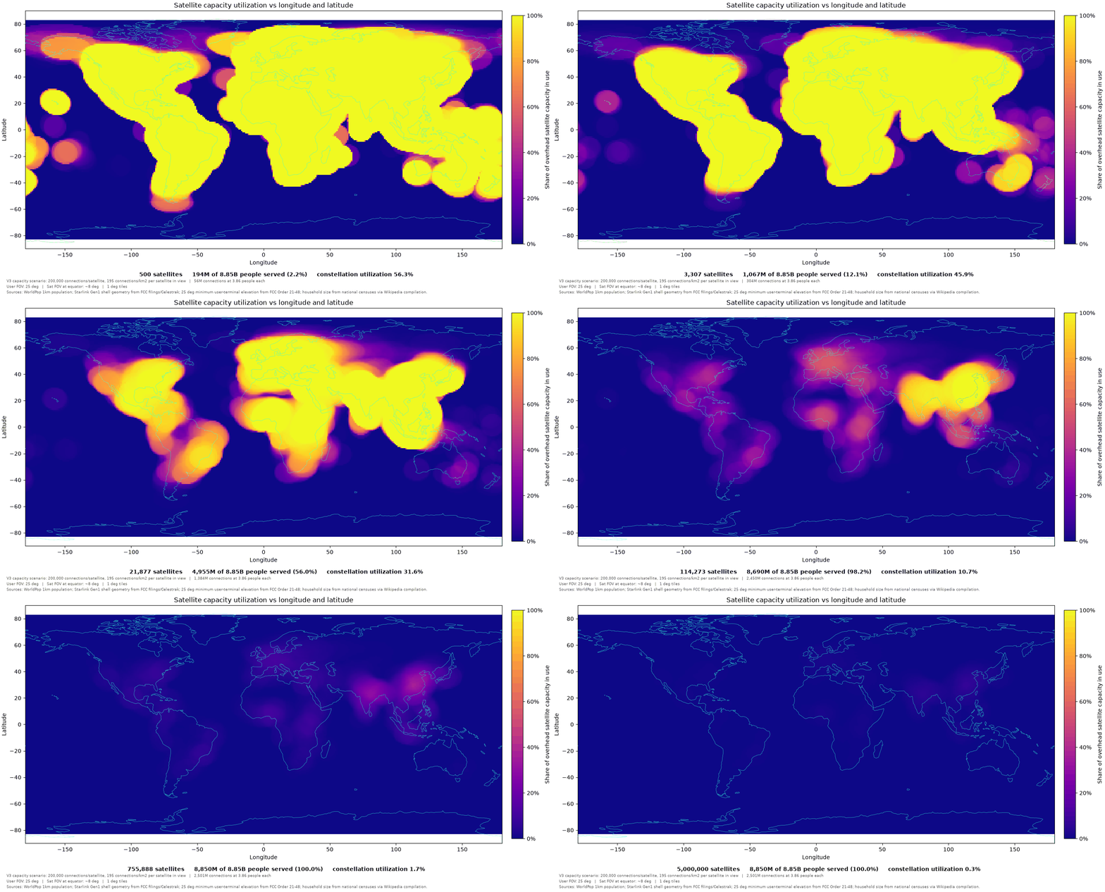
To cap off this section, here is a gif showing the global satellite utilization vs constellation size using my tile capacity model, where the Earth is split into 1x1 degree tiles with satellites probabilistically allocated by latitude, as described previously.
Apart from being strikingly beautiful, we can learn a few things.
First, when the satellite constellation is fairly small, utilization is extremely high. This is because the servable population density is unsaturated nearly everywhere, so satellites are 100% in use nearly everywhere. Note that this model assumes SpaceX acquires enough customers to saturate 100% of capacity, as will be described in the next section.
Furthermore, satellite utilization remains high for a longer period of time over the most densely and highly populated sections of the Earth. In order of most to least we have: China, India, Europe, Central Africa, America, Brazil, etc.
Sourcing Global Telecom Data To Determine TAM
We finally have a model to have our global satellite distribution serve our global population distribution, however, in the previous section we did not discuss how we would allocate capacity within the field of view of a single satellite or how much we could charge for internet access.
In this section, I will answer the latter question and source global telecommunications data to determine how much Starlink - or a similar satellite internet constellation - can charge for connectivity in every country in the world.
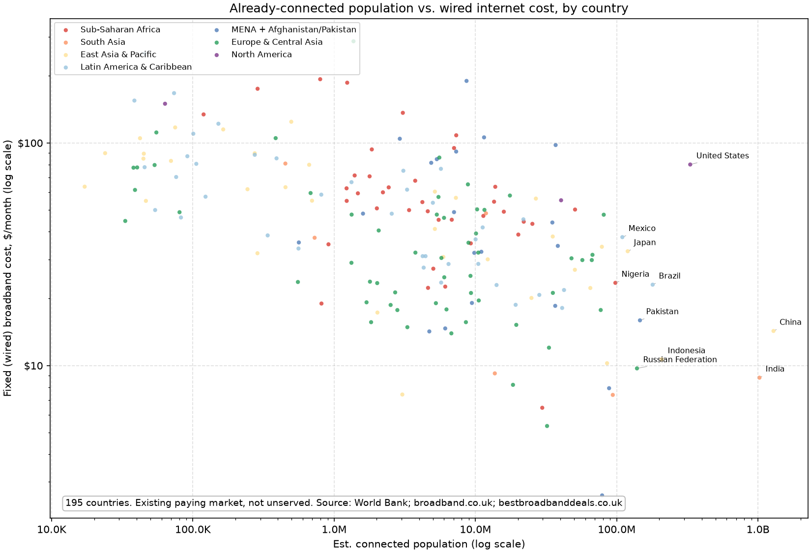
To begin this analysis, consider the scatterplots of broadband connectivity cost vs connected population in every country. The purpose of these charts is to begin to elucidate the problem space to you.
Interestingly, we see a slight negative trend where countries with more connected people have lower internet costs. This could be due to some sort of economies of scale, or higher-order effects where more populous countries have larger poor populations, which results in lower connectivity costs.
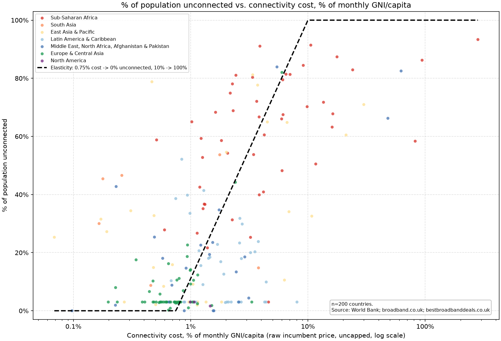
Next, we plot the proportion of a country that isn’t connected to the internet versus the connectivity cost in that country as a % of monthly GNI/capita.
This chart allows us to derive an elasticity for connectivity cost. This will allow us to model the price that Starlink can charge in a given geography, by how many users are being served in that geography. For example, if there is a small number of Starlink satellites in the constellation, they can charge relatively high prices and serve a small portion of people. However, as they expand the constellation they have to bring down prices to gain more customers.
My perspective on economics is that the dark secret is everyone knows that their models are incorrect in magnitude. However, being directionally correct is a far more achievable endeavour. It’s for this reason that I tolerate modelling elasticity as a line drawn onto a graph without any fancy fitting. Sure, I could fit an S-curve or any function of your choice to the scatterplot, and it’s possible my model becomes more correct in magnitude, but, again, my goal is to be directionally correct as being correct in magnitude is a path fraught by failure (As I learned trying to estimate US EV adoption).
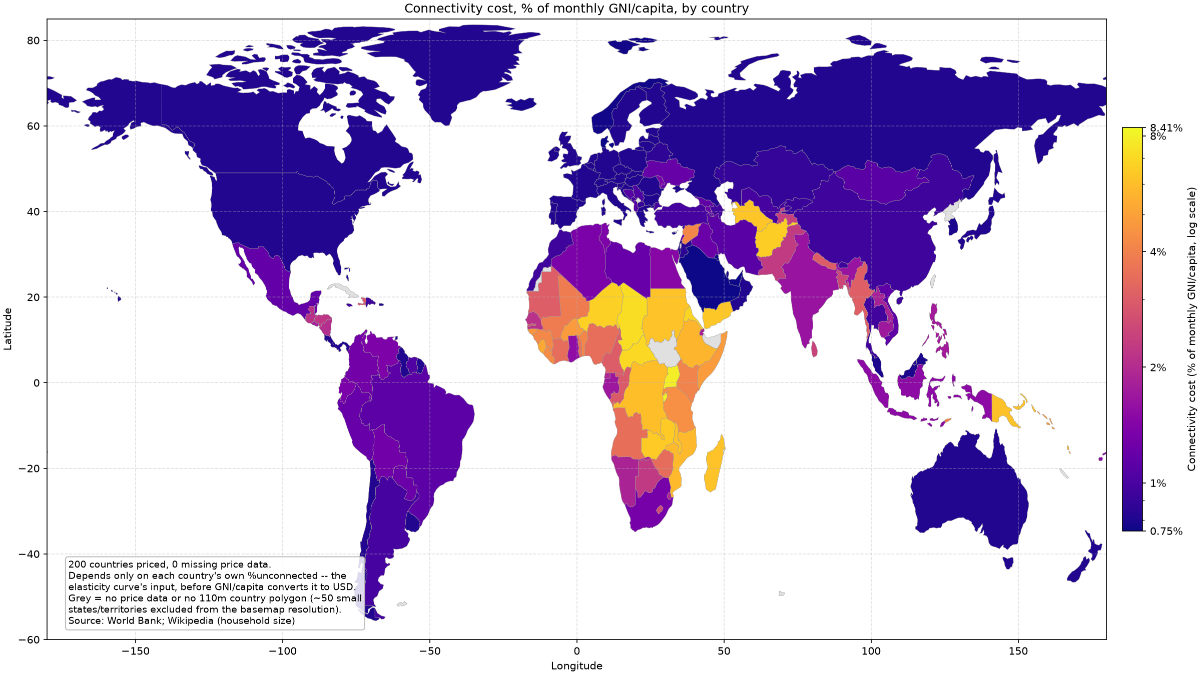
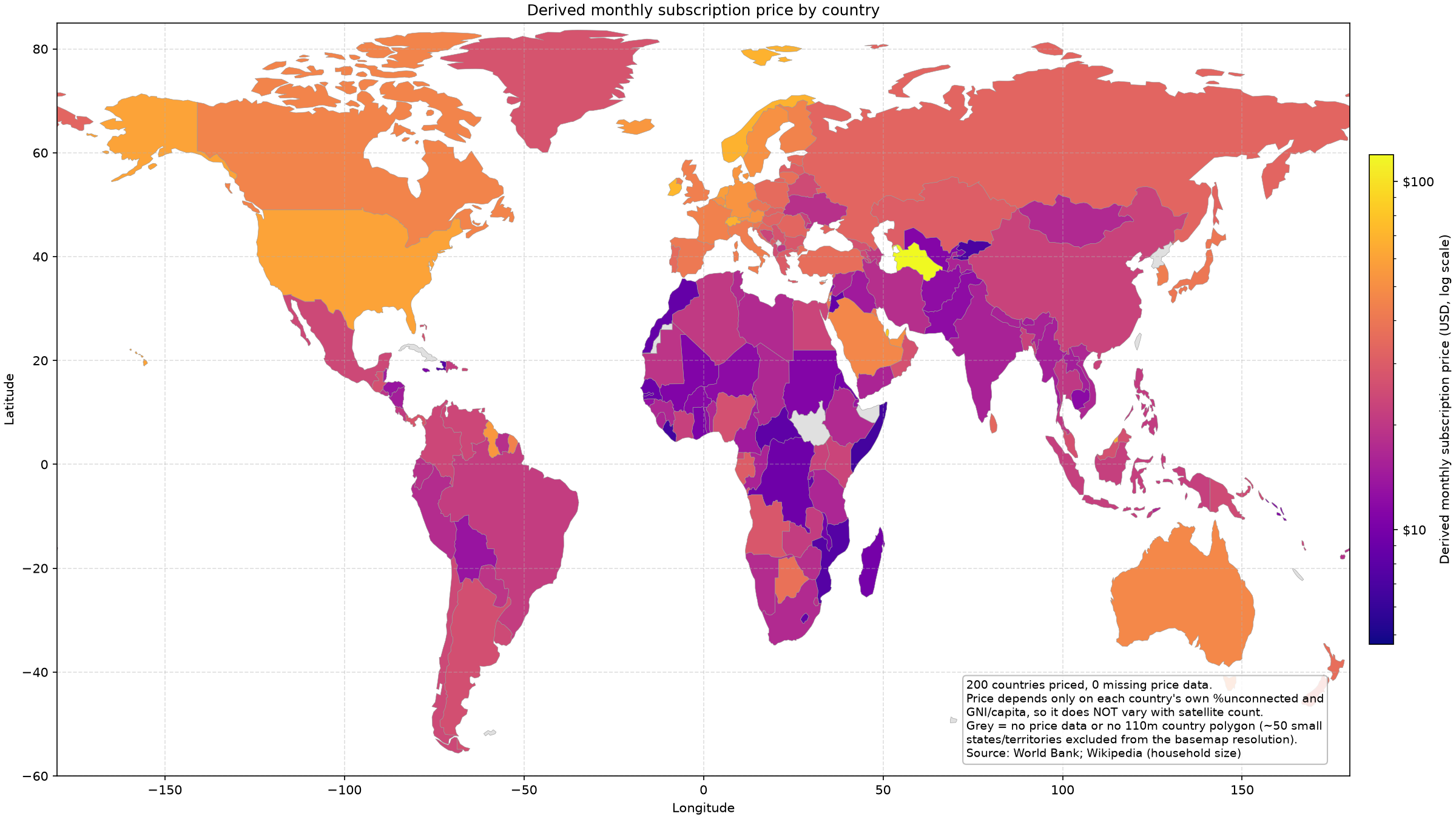
To help illustrate connectivity cost across the world, the choropleth charts above show existing connectivity cost and the price that Starlink could charge in every country, derived from each country’s unconnected share and GNI/capita.
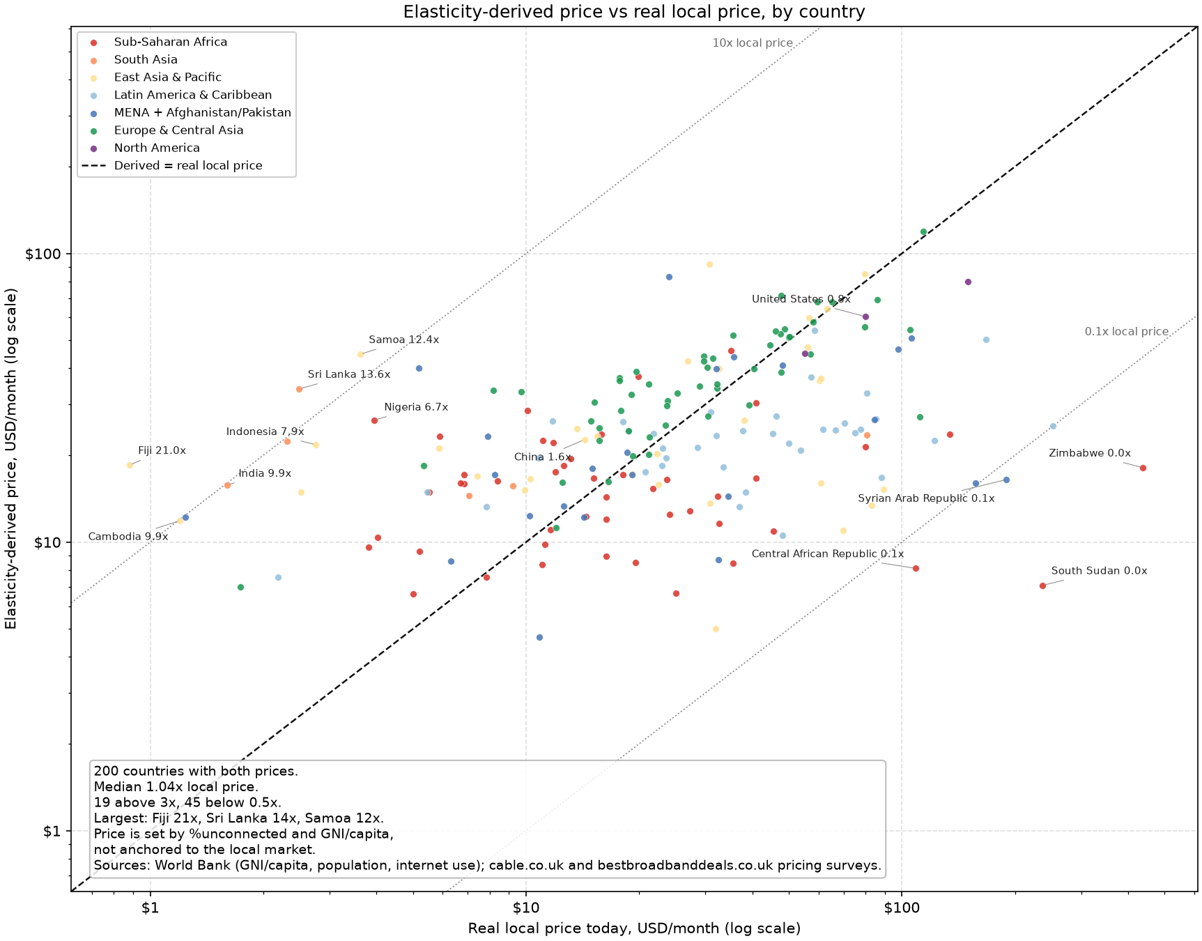
My elasticity model is not perfect and it breaks down when there exist large countries that differ from the elasticity line. This is especially evident with markets like India and Nigeria, where population is extremely high and my elasticity derived price of connectivity is 10x more expensive than the existing local price of connectivity. Thankfully, I’m equally wrong on the 10x less expensive side of the equation.
Take this as a case study in the tradeoffs you make in chasing directional correctness in a model versus being correct in magnitude. If I wanted to be correct in magnitude I would have to put many more hours of effort into this model, which may only increase accuracy by 10%.
Capacity Allocation Model
Now we have satellites, population, and the price we can charge to that population. Next we have to allocate our satellite capacity to users and consider when we switch from a strategy of only serving previously unserved users to competing with terrestrial ISPs and stealing customers.
Starlink is inherently distributed infrastructure, which means it does not follow the same capacity allocation model as traditional fiber optic cables. As discussed previously, Starlink satellites are distributed in shells around the planet which means capacity is roughly evenly distributed around the world (minus the peaks at certain latitudes we saw previously). This means that we aim to acquire as many customers around the world as possible, and not merely focus on building a fiber optic line to serve a given number customers in a given geography.
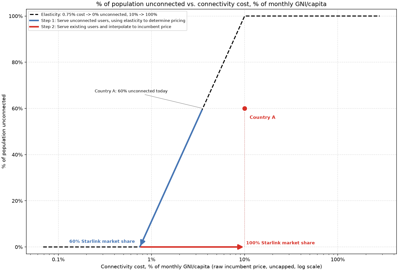
The chart above shows how the previously derived elasticity is used to determine the price to charge in a given country.
The elasticity chart can be used as a lookup table. For example:
- We know we have eg. 1,000 Starlink satellites in orbit which allow us to serve 1,000,000 users in Country X
- We want to set our price in Country X such that 1,000,000 people part with their hard earned money and buy a Starlink user terminal and subscription
- If 1,000,000 people happens to be 20% of the population of the country, we go to the point on the elasticity curve at initial country X unconnected population (eg. 60%) minus 20%, which gives us 40% of people remaining unconnected.
- The price at 40% on the elasticity curve is ~2% of monthly GNI/capita, which equates to eg. $10 USD/month.
With this model, we keep increasing capacity and decreasing subscription price until we’re serving 100% of the previously unserved users in Country X.
However, once we’re serving all those that previously didn’t have access to the internet, we can start competing for customers that are already served. Or, start competing for them before we saturated unserved customers, which is what would happen in reality and is slightly harder to model.
To take into account stealing existing customers, I lock in the existing subscription price and begin stealing customers by linearly interpolating my previously elasticity-derived price to the existing cost of connectivity in that given country until 100% of users are served. This is illustrated by the red line in the diagram above.
This method allows for separate accurate pricing of unconnected users and connected users, but isn’t particularly elegant in the way it’s joined (no elasticity curve has a discontinuity like I drew as the red line above). However, being correct in magnitude of TAM isn’t as important as being directionally correct, so I call this a suitable method.
In the case that two countries with differing subscription costs are side by side, my model serves them proportionally by how many people live in both countries. This method doesn’t maximize revenue as it’s closer to maximizing connections, and results in smoother TAM vs satellite count graphs.
TAM of Serving Previously Unconnected Users
Finally, we’ve constructed a model that can be used to determine Starlink’s TAM. We’ll start with just serving previously unconnected users, to derive a conservative TAM value.
Note that this analysis can also be applied to any other satellite constellation, but SpaceX is the only one that has proven its ability to execute in this field and it’s safe to say they’ll be without significant competition for years to come. Satellite constellations are a very hard problem!
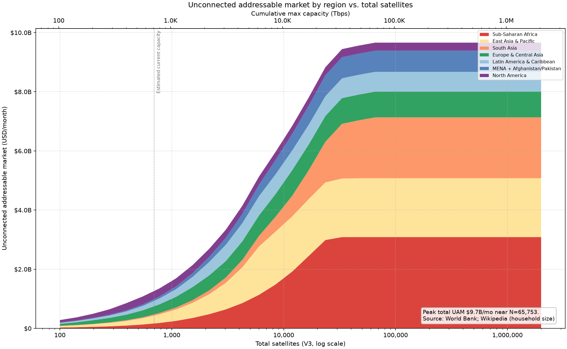
The graph above shows TAM in USD/month vs constellation size in number of Starlink V3 satellites and cumulative deployed capacity in Tbps. We notice that the terminal TAM at ~35k Starlink V3 satellites is nearly $10B/month = $120B/year.
The shape of the TAM vs satellite count curve is an S-curve because new markets are unlocked (higher population density), and later the previously unlocked markets are saturated. Thankfully, we unlock more new markets before our previous markets saturate!
Previous satellite constellations like Iridium saturated available demand at their current size and cost before they could ride the cost curve down to unlock the next market. This inherently limited constellation size and drove a breakdown of growth.
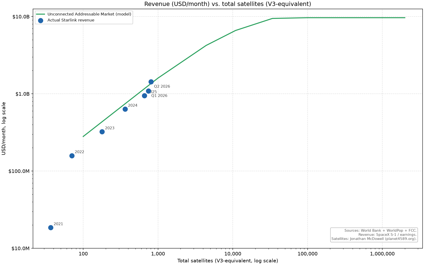
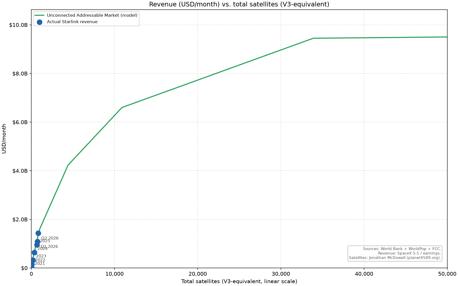
As a litmus test of how accurate my model is, above is a backfit to SpaceX’s historic Starlink revenue vs the number of satellites. On both the log and linear chart, SpaceX’s growth follows surprisingly closely to my model! Great success!
This result is surprising because I don’t expect my elasticity model to perfectly reflect reality and I don’t believe SpaceX’s capacity is currently fully saturated around the world. This is to say that SpaceX likely makes more from high-income countries than I model and less from low-income countries than I model. These effects seem to nearly perfectly balance each other.
To Conquer The Earth’s Telecommunications Layer
“You would much rather have a lot of opex versus a lot of capex. And I think part of that is if you have a lot of capex you lock yourself into some future, versus if you have a lot of opex you can swap things out faster.”
- Ti Morse, Relentless, to Ethan Thornton of Mach Industries (Timestamp 27:30)
Starlink is in the very unique position of being able to Conquer the Earth’s Telecommunications Layer. The final two sections of this blog post will quantify how much could be made, and how it’s already economically possible with Starship V3 and Starlink V3.
SpaceX does not operate in the same geography-enforced connectivity domain that terrestrial ISPs do. If SpaceX achieves low enough costs (see the next section) and regulators allow them to compete freely with terrestrial ISPs, they are positioned to poach many customers from them.
As Ti Morse describes above, opex-heavy businesses allow far faster iteration and expansion than capex-heavy businesses. At Terraform Industries, we apply this idea by building 1 MW Terraformer units that produce natural gas. Instead of large centralized singular refineries which encompass multi-decade long infrastructure projects, we build and iterate on assembly lines. This allows us to rapidly decrease cost and iterate on electrolyzer, DAC, and reactor design.
Described in another way, this is the difference between a one-time massive capex expenditure and continuous capex expenditure.
Satellite internet constellations are continuous capex expenditure telecommunications systems (launch + satellite manufacturing) whereas all legacy systems are one-time capex expenditure telecommunications systems (laying fiberoptic cables).
This distinction is what allows Starlink to rapidly decrease cost and the global distributed nature of Starlink is what allows them to poach customers without extreme effort. Previously, telecom companies would have to deploy infrastructure in regions their competitors already serve to poach competitors. SpaceX simply sells a Starlink user terminal in a Home Depot or on Amazon and they’ve poached a customer. Notice the distinction between a continuous stream of small capex deployments (terminal sales) versus a single large infrastructure project (laying new fiberoptic cables).
This is an extremely powerful position to be in. The legacy prerequisite to competition was a billion dollar investment to run fiber in an entire city and steal customers that are already served by a competing ISP, with no promise of profitability for years or decades to come. Now, Starlink can launch a constellation, become profitable on customers that were previously completely unserved(!!!), and then (after already being profitable!) begin lowering the price of the subscription so that already served customers give their own money for a user terminal and become subscribers.
Instead of a billion dollar investment with no promise of success, Starlink becomes profitable on unserved users and then ambiently begins poaching users where each user pays them for the right to be a user! Expansion is driven by each user paying hundreds of dollars for a user terminal! Alternatively you can subsidize the low capex cost of the terminal and amortize it over the subscription period to entice ever more customers!
Tim Farrar pointed out that my treatment of Starlink terminal costs and other minor costs wasn’t rigorous enough, so here is an update. The conclusion doesn’t change enough to warrant an explanation here, everything above remains directionally correct.
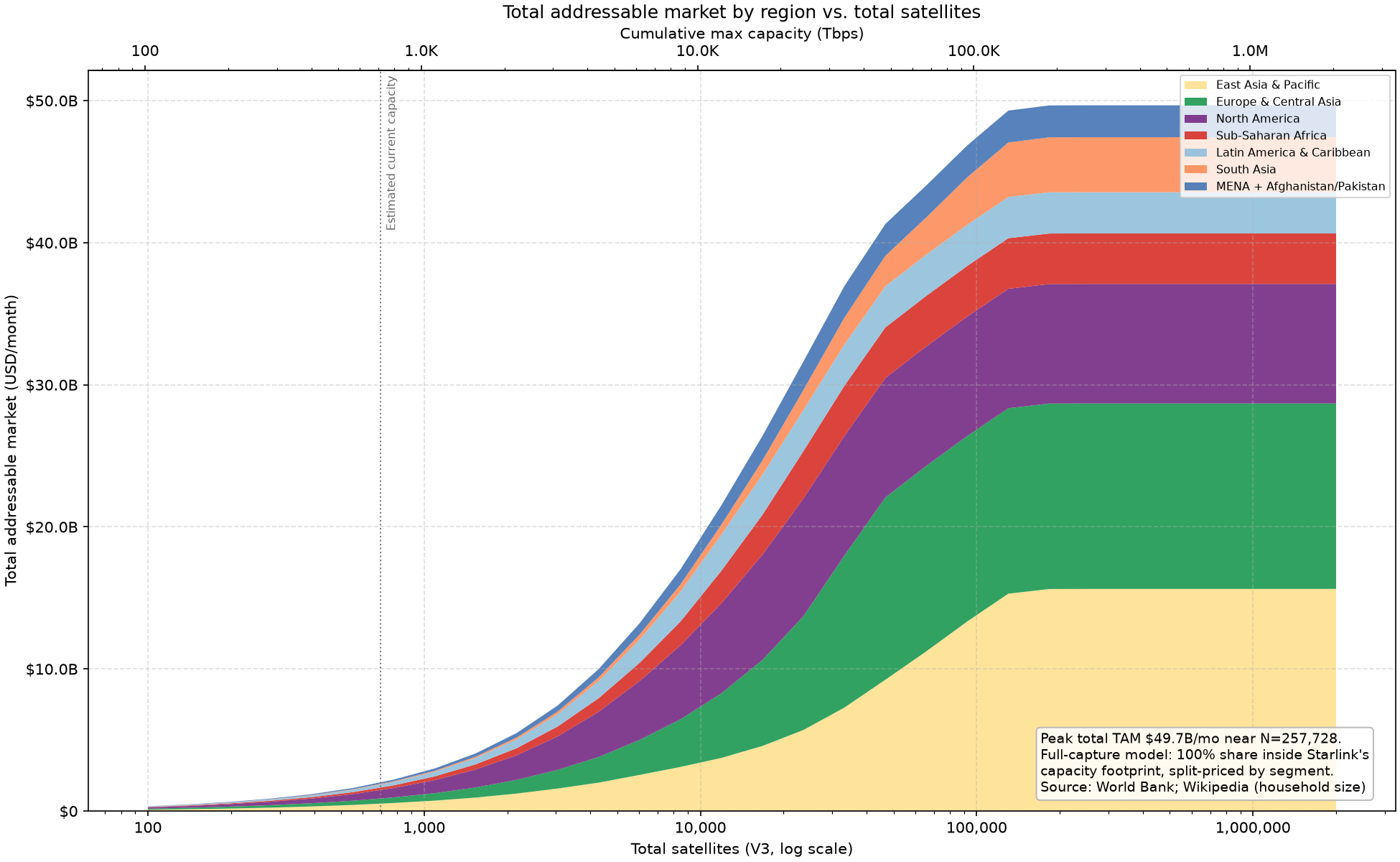
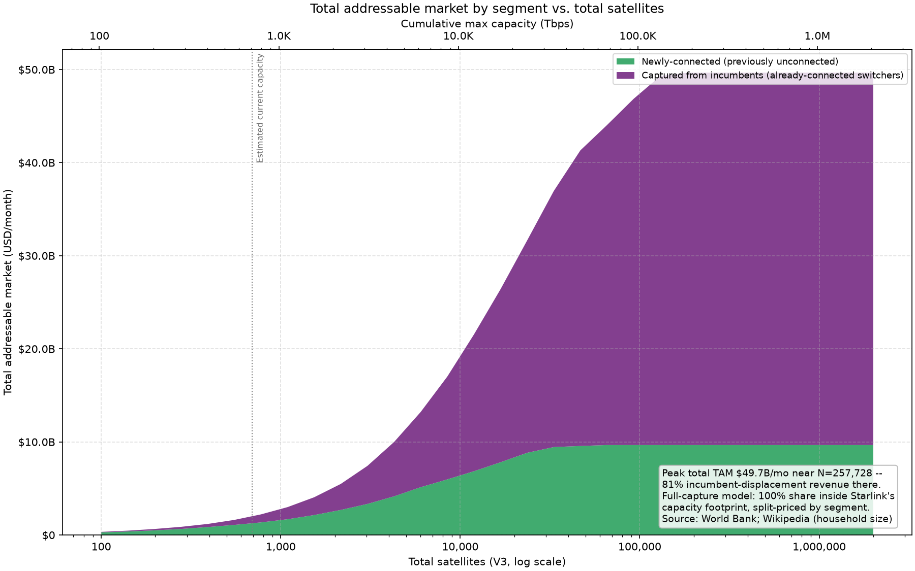
Now, we can quantify the beautiful picture I elucidated above. Starlink can saturate current global household internet demand at ~100,000 Starlink V3 satellites and make ~$50B/month = $600B/year. This is 5x higher than the TAM for serving purely previously unconnected users.
The TAM of global telecommunications is currently 1-2 trillion dollars. My estimate is 2-4x low because of not pricing secondary markets like mobile data, phone calls, business specific services, etc.
SpaceX is competing directly for the mobile data market, which raises their TAM even higher beyond the scope of this analysis.
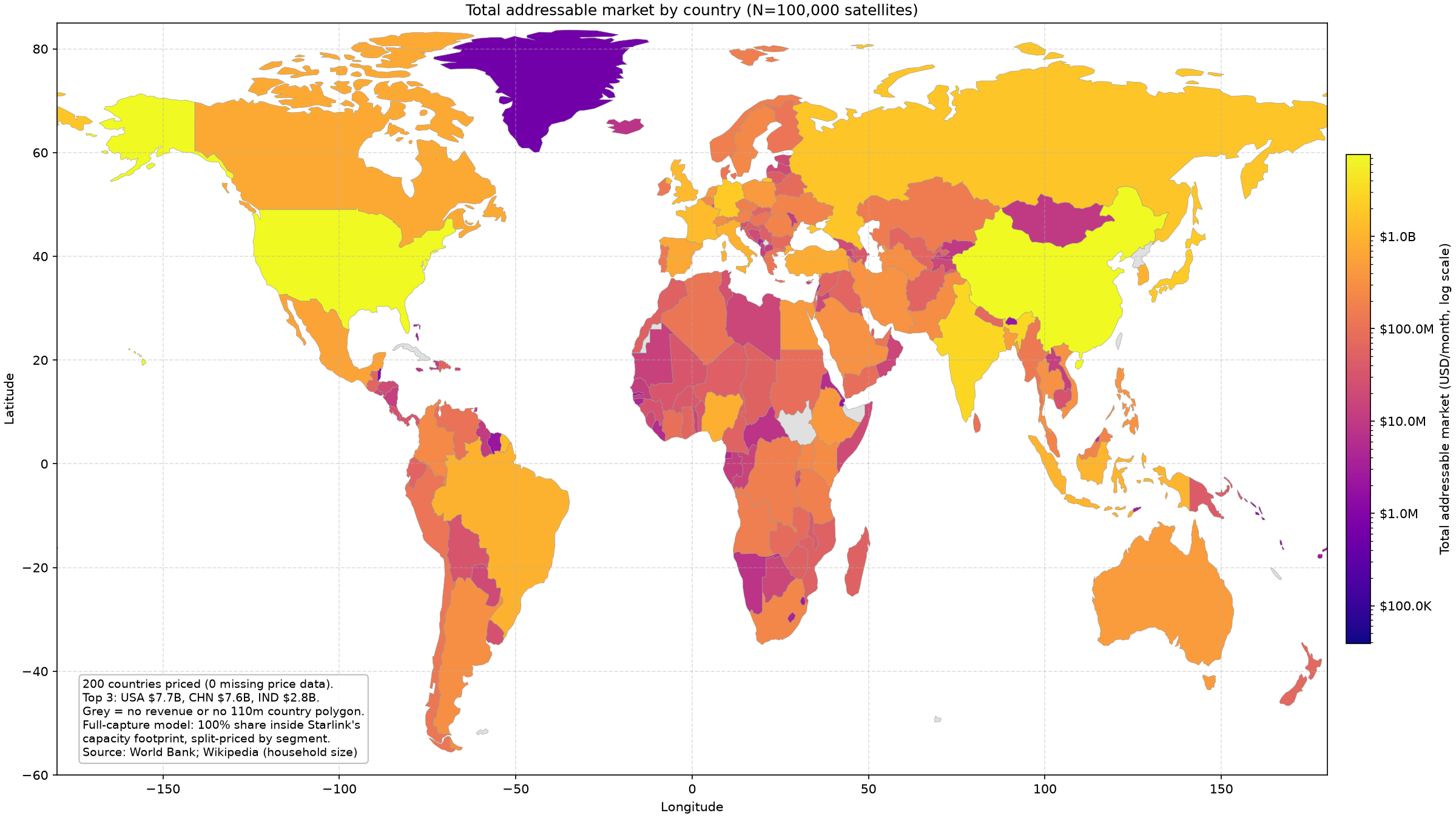
Furthermore, Starlink will demonstrate how the internet increases the achievable GDP per capita of individuals after they gain access to the internet, which will force TAM even higher.
Earlier, I showed how my model used GNI/capita as a metric for pricing the subscription cost in each country. Above, the TAM by country chart shows the global distribution where countries like the US, China, and EU countries are quite lucrative while African, South American, and Middle Eastern show far lower values.
As internet connectivity is introduced into these countries, their ability to generate value for themselves is increased. This allows individuals to increase the GDP of their nations.
If you need examples to illustrate this behaviour, consider these examples. First, knowledge work is introduced as a sector of the economy. A more concrete example is that businesses will be able to access the internet and make markets more efficient. Eg. the area of customers a business can address will expand as they can identify more of them via the internet, and investments into infrastructure will be spurred on by this phenomenon.
Starlink provides the same service in Africa as it does in America, but it must charge far less in Africa. This can be explained by the phenomenon of food being cheaper in poorer nations. The primary input into food production is labor or embodied labor (eg. the labor required to build a tractor), because the labor is cheaper, the food is cheaper too. However, the cost of living reflecting lower wages extends to how much can be spent on things like connectivity. Inherently, the reason Starlink can charge more in America is that Americans are richer.
As internet adoption drives economic growth in these nations, Starlink will be able to capture a portion of the growth by increasing subscription prices. For providing the infrastructure for nations to raise their own output and standard of living, Starlink will take a small share (~1% of monthly income, as evidenced in developed nations).
Satellite Utilization: How Cheap Starlink Can Get
Behind the global conquest I described in the previous section, is the assumption that Starlink will become cheap enough to capture the telecommunications demand of the entire world.
Previously, many have dismissed this as possible due to servable population density limitations of satellite constellations, which I previously addressed. A corollary of this problem, is whether servable population density can be economically addressed. Each additional satellite increases the servable population density, but also decreases satellite utilization because already saturated geographies become supersaturated (eg. satellite utilization over rural areas goes from 50% to 25%).
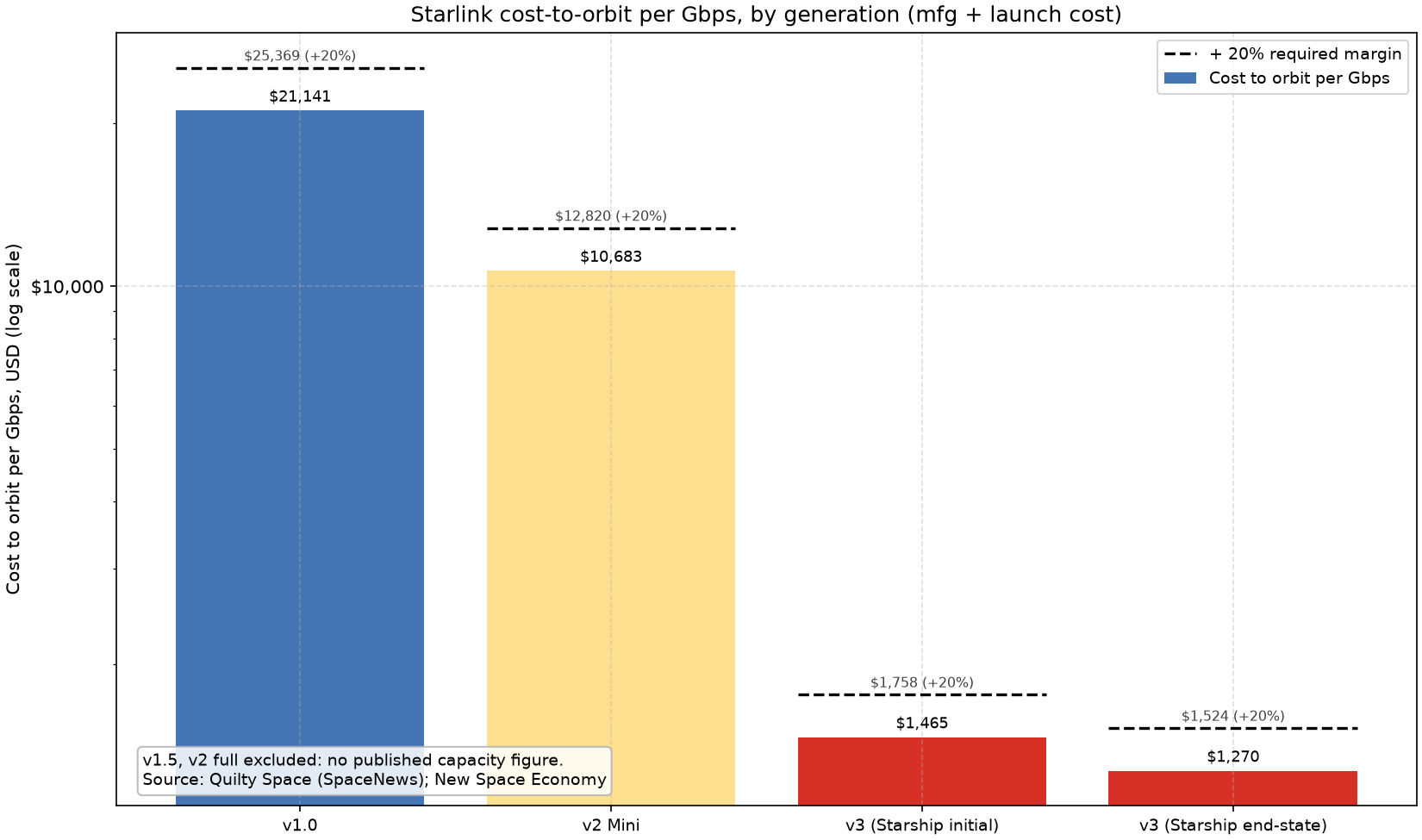
To find the size of the market that we can economically serve, we first need the cost for us to provide connectivity. This is measured in $/Gb/year. To derive this value we take the cost of a satellite, divide it by its downlink capacity, and divide again by the number of years it is in orbit.
Notice that Starlink v1.0 -> v2 Mini was a 2x decrease in cost and v2 Mini -> V3 is a decrease in cost of almost 10x!
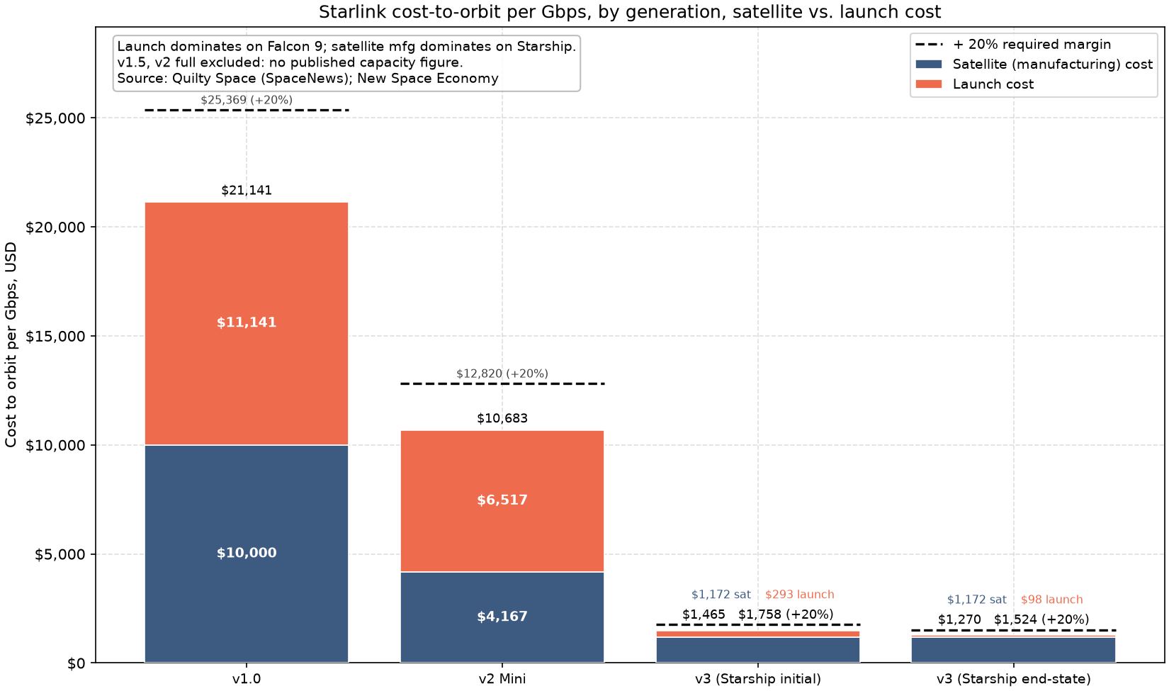
Surprisingly, the decrease in cost from v2 Mini to V3 is primarily from the cost of the satellite itself decreasing (cost per unit capacity, $/Gb), not the cost of launch decreasing due to Starship (Amdahl’s law strikes again!). The dominating factor is the satellites getting denser (Gb/kg), not the $/kg of the launch vehicle decreasing.
SpaceX’s competitive advantage isn’t just having the cheapest access to launch in the world (by a factor of 10x!), but also in having satellites that get 10-100x more output per kg than competitors who are still stuck behind Starlink v1.0 levels of performance.
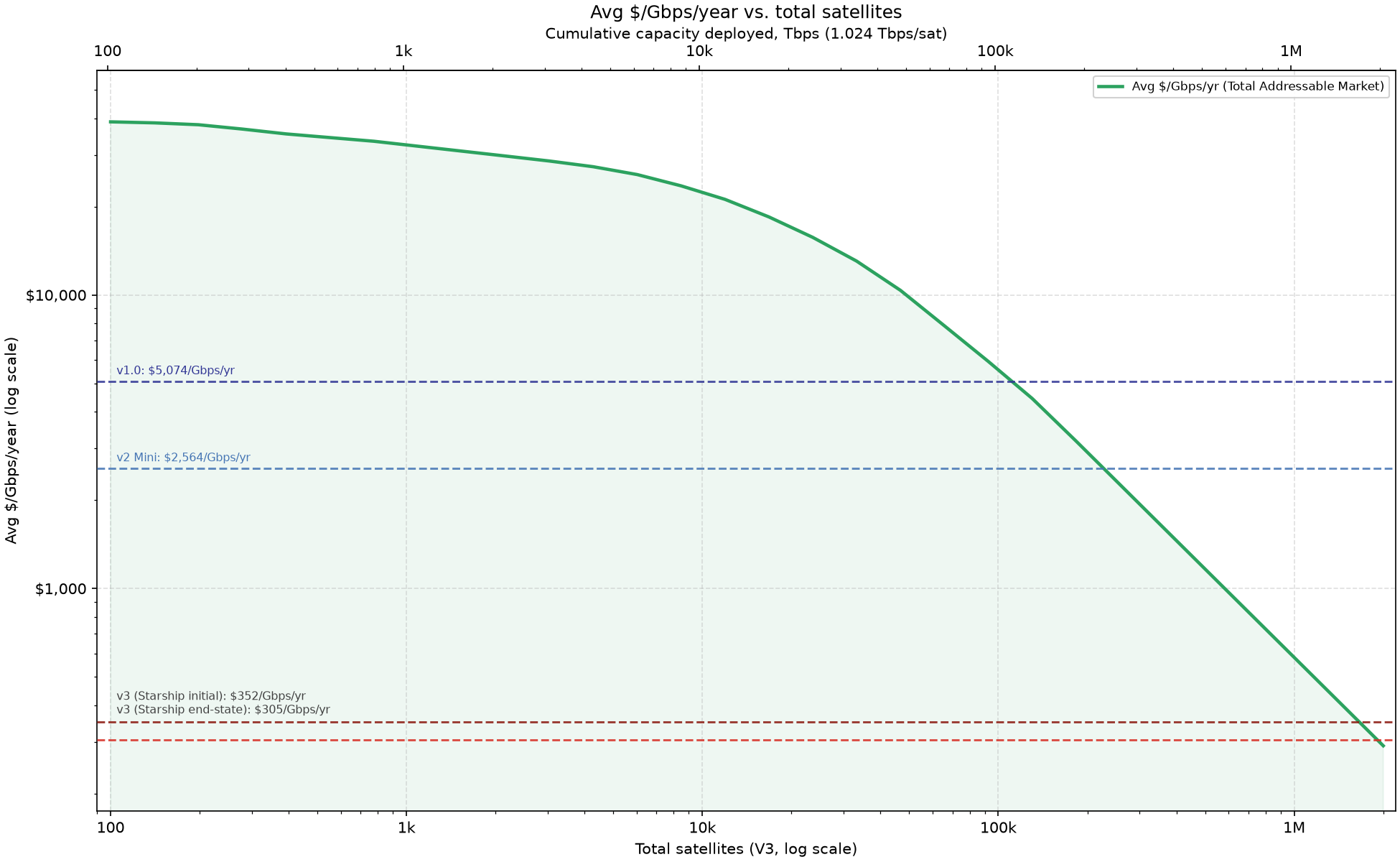
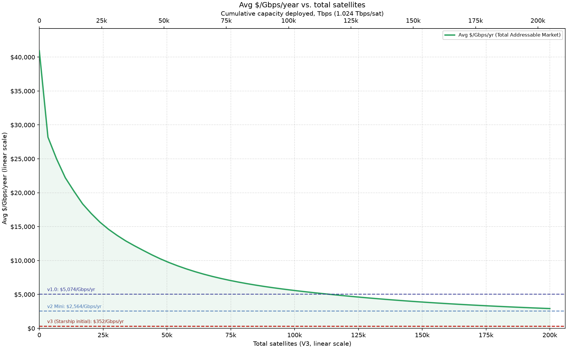
Now that we have a cost model, we need a price model that gives us the price that the marginal Starlink user will pay as we increase the size of the constellation. To this end, we plot the average $/Gb/year users pay vs number of deployed satellites. This arrangement gives us a market ladder.
The market ladder allows us to see how much of the market is available to us if we can serve customers at a given cost. To find the maximum market size, we take the intersection of the $/Gb/year curve and the horizontal line which represents satellite cost.
Surprisingly, we find that Starlink V3 is already cheap enough that SpaceX could deploy 1 million satellites and remain profitable!
Furthermore, we find that the Starlink v1.0 line intersects the demand curve at ~100k Tbps which is enough to serve all unserved customers in the world while remaining gross profitable! SpaceX could not in reality deploy the 5 million Starlink v1.0 satellites required for market saturation given that Falcon 9 launch cadence sets a limit of ~10,000 satellites launched per year.
This result shows that the difficult part is not achieving the required cost to Conquer The Earth’s Telecommunications Layer, but scale is the only limiting factor.
Conclusion
The path to Conquering The Earth’s Telecommunications Layer should now be clear.
In this blog post I built a directionally correct but inaccurate in magnitude (which is a futile task anyway) model that showed a ~$120B / year TAM if Starlink serves every human on Earth who currently does not have internet access. If Starlink competes with terrestrial ISPs, the TAM grows to ~$600B which given adjacent verticals (mobile data, businesses, aircraft, etc.) grows to ~$3T.
Most fundamentally, we found that with the Starlink V3 satellite, SpaceX has built a platform that will allow it to decrease costs to the point where it can outcompete every terrestrial ISP. I haven’t seen anyone else do that analysis or come to that conclusion.
Starlink’s current annual revenue is ~$15B/year. SpaceX is nowhere near reaching market saturation. Growth will continue. (Words that will reflect SpaceX’s trajectory for decades to come)