Fun Charts That Visualize The History of Communicatons Satellites
.png)
This is the chart from the previous blog post.
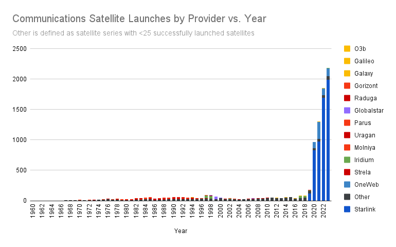
In my blog post from 6 days ago I wrote about the insights I gained along the way to chart out communication satellite bandwidth cost over time. As part of that blog post I created the chart you see above of communication satellites launched over time and described some of the the bumps you see on it. However, without any colour coding or categorization, it’s difficult to parse. So, I suffering in Google Sheets for a few hours and categorized the data by Satellite Series so you could better visualize my points.
So, here’s 4 fun charts that visualize the history of communications satellites with an explaination under each one of interesting points.
.png)
This is the same chart as the one above but with colour coding for each satellite series. Just appreciate for a minute how information dense it is now!
By removing Starlink, we can better see the history of Communications Satellite launches. You can clearly see the Iridium V1 bump from 1997-1998, and directly after it the Globalstar bump, which were Iridium’s chief competition back in the day. This also illustrates the massive launch requirements for internet constellations vs. call constellations with the size of the Iridium and Globalstar bumps relative to OneWeb (and of course Starlink, but that’s on a whole other level). All the red on the chart is all the other Soviet/Russia satellites and the yellow is western communications satellites and Galileo, which is the European GPS system.

This chart is the same as the one above but includes Starlink, notice how you can learn pretty much nothing except that yea Starlink is still winning and Elon is the most important living human.

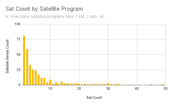
Just for fun, you can see the power law distribution of satellite programs by the number of satellites launched. As you’d expect, most satellites are one-offs or part of a small series, you get what’d you’d expect after that, an exponential decay.

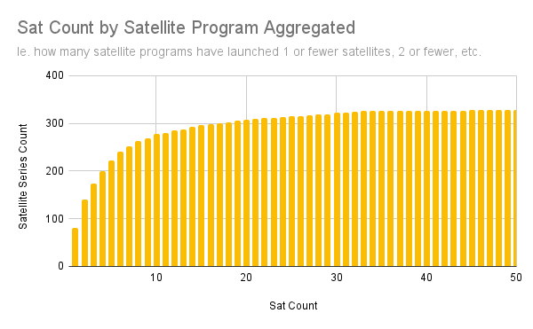
This chart is another way to illustrate the power law distribution of satellite programs as you can see how many satellite programs have launched 1 or fewer satellites, <=2, <=3, etc. The previous chart is the derivative of this function.