Estimating Cost per Mbps of Communication Satellites Over Time
Find my raw data here.

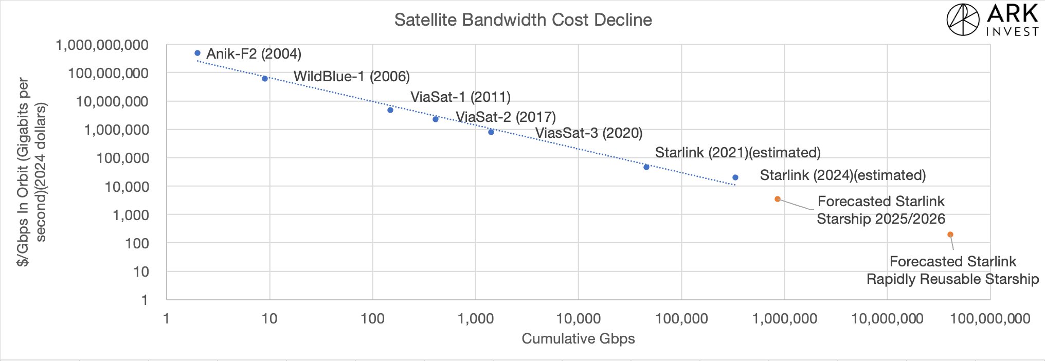
This is the Ark Invest chart that inspired this blog post.
Three hours ago I saw (Space) Case Taylor reply to a post Sam Korus of Ark Invest made in which he showed a chart of satellite bandwidth cost over time. You can see this chart above and it clearly shows the exponential cost decline of satellite bandwidth over time, the beauty of learning rate in production. As an exercise and an opportunity to learn more about the communication satellite industry, I decided to derive a similar chart myself.
Read the sequel to this blog post to get better charts the describe the history of Communications Satellites.
Using Jonathan Mcdowell’s Dataset

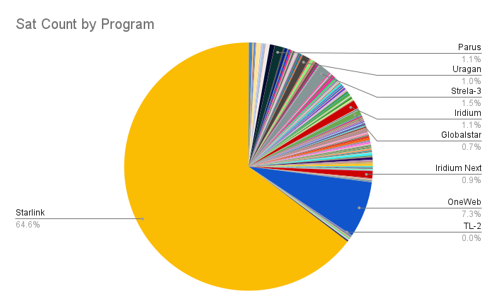
This shows share of total communications satellites launched in all of history by satellite program.
The first step was to filter Jonathan Mcdowell’s dataset to include only communication satellites. I’ve worked with his dataset for over a year and already did this a while ago. This resulted in a list of 8,691 communications satellites successfully launched between 1960 and 2023 (inclusive), the first of these being Transit 1B on April 13, 1960. This data isn’t directly pertinent to the result I’d like to get, but the journey is important and there are insights to be gained from this, these insights are the purpose of this section.

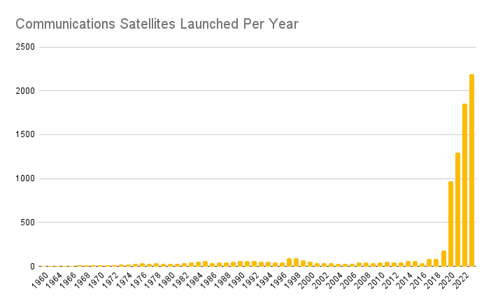
That massive wall post 2020 is Starlink.
As is a common theme in trying to analyze the satellite industry, SpaceX’s massive market share makes it very difficult to extract any insights from the raw charts, and if you want to learn anything other than “yea SpaceX is still winning” you have to exclude them from the dataset.
.png)
Without Starlink, you can get a feel for the history of communications satellites.
Above you can see communications satellites launched per year excluding Starlink and there are a lot of interesting stories behind all the bumps and increases.
The 1997-1999 bump is mainly due to the initial Iridium satellites. The majority of these satellites were launched by the Delta II out of SLC-2A, Iridium practically owned all launches out of this pad for a couple years. They had 40% of all launch contracts in the world during this time. I’ve been reading Eccentric Orbits and there are a lot of fun stories about Iridium’s early days. Another one is that in the lead up to the initial launches, the GPS IIR-1 launch failed and the Delta II was grounded for a few months, you’ve probably seen the video of this and Scott Manley has a great video on it, as it’s one of the most spectacular launch failures in history. It’s also the origin of the “we have had an anomaly” meme circulating on X.
The smaller 2017-2018 bump is the Iridium NEXT launches on Falcon 9. Post 2020, the large increase is due to all the OneWeb launches on Soyuz, Falcon, and ISRO’s LVM3.
Getting Price & Bandwidth
With the data on every communications satellite ever successfully launched, I narrowed the dataset down to only programs with more than 20 satellites launched of a single series. This narrowed it down to 33 series of satellites. Some of these could be combined (eg. Jonathan Mcdowell lists many subcategories of Starlink satellites when I only needed V0.9, V1, V1.5, and V2 mini) or ignored (it’s difficult to get pricing data on Soviet Molniya satellites launched in the 70s). I was left with a set of 16 satellite programs/series to analyze. With the help of Grok, ChatGPT, and the internet I got price and bandwidth estimates for each of the satellites including manufacturing and launch. Many of the early satellites didn’t have good data and the LLMs hallucinated often, but the prices generally seemed to be in the right order of magnitude, which is sufficient for this analysis. Later satellites like Iridium, OneWeb, and Starlink had good data available, so the important data points would be reasonably accurate.
Here I’ll note that this is not the approach Ark Invest took, they used a set of GEO & Starlink satellites with good data on them and fit a trendline to the price per Mbps. For my next attempt this is probably what I’ll do, start with satellites that have good price data instead of satellites with many launches.
 of Satellite Programs & Year Of First Launch.png)
You can see that bandwidth per satellite has been increasing exponentially over time.
Above you can see the bandwidth of single satellites from various programs over time. There are four primary categories here, early communications satellites (Molniya), early LEO satellite phone constellations (Iridium, Globalstar), GEO satellites (O3b, Intelsat (IntIS on the chart), SES Galaxy), and LEO internet constellations (OneWeb, Starlink).
The early satellites like Molniya and Iridium supported such low data rates that they’re not even visible with Starlink on the chart. Each Iridium call was on the order of a few kilobits per second for audio transmission, and the Molniya satellites were even worse. In contrast, internet requires megabits per second, a minimum of 6 orders of magnitude more data.
The GEO satellites also had high total throughput compared to the early LEO constellations. These satellites provided TV, data, and phone service to entire continents, while the early LEO satellites served a few thousand customers at a time. This meant total data throughput to customers could be much higher for single satellites, especially given that many people could tune into a single TV channel at once, meaning a single signal from a satellite could be received by far more people than would be involved in a phone call. This is part of the reason I didn’t include any GPS/GNSS satellites in this analysis, it’s not clear what bandwidth means in the context of a GPS satellite where you’re just broadcasting a constant signal to be received by a huge number of receivers.
Results

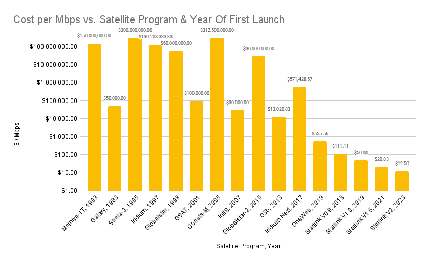
We see an exponential decline in cost per Mbps over time on this logarithmic chart.
In the previous section, I described the 4 major categories of satellites that I included in the dataset. Because these satellites have different purposes, we see ~3-4 orders of magnitude difference in the 1983-2017 set of satellites. This is because the GEO satellites can deliver far more bandwidth to customers than the LEO satellites like Iridium, so the cost per Mbps differs a lot. This is similar to the issues you encounter when using $/kg as a metric in launch vehicles, Electron is several times higher than F9 but still has customers because its customers have different needs.
Again, this is a reason to do the analysis in the way Ark Invest did instead of the way I did. Maybe Sam Korus of Ark also ran into similar issues as I did in doing his research and he course corrected before publishing a graph. I’m not profesional enough to not show my work, so this blog post is full of interesting intermediary results.
Post Iridium Next / OneWeb in 2017 and 2019, we see an exponential decline in the cost of bandwidth with LEO broadband satellites. Remember that these numbers are mainly illustrative of the shape of the graph since SpaceX doesn’t give us precise internal launch cost and satellite manufacturing numbers, but the trend is clear. The cost of bandwidth from space has been exponentially declining and is likely to continue as satellite technology continues to improve, the scale of the satellites increases with Starlin V3, and competition enters the arena.